
Dashboard, Delivery Analytics and Forecasting
One place to open the day: a delivery dashboard, project health metrics, and an AI-assisted forecast of when work lands.
These images are illustrations of the concept, not screenshots of the actual product.
Overview
This concept covers the layer of PlanMagnet a team opens to answer one question: are we on track? It moves through three connected surfaces — the workspace shell and dashboard that frame the day, an analytics view that measures project health and team performance, and a delivery forecast that turns recent sprint history into a likely completion window.
The problem it addresses is a familiar one. Delivery numbers usually live somewhere other than the work: a spreadsheet updated by hand, a chart exported last week, a date promised from memory. By the time a status update is circulated it disagrees with the board it was drawn from, and nobody can say which sprints a projection actually rested on. The design envisions counters and charts computed from the same work items the team is already moving, and a forecast that shows its inputs instead of asking to be trusted.
Across the illustrated screens the experience builds up in layers. The first view establishes the shell: a persistent left rail grouping the product's own modules alongside shared workspace modules, a top bar with an organization, workspace and project switcher, and a breadcrumb that keeps the current page located. The analytics view then fills the content area with counters for work items, story points, active projects and blocked items, panels for sprint velocity and task distribution, compact tiles for average velocity and at-risk milestones, and a project health section. It is drawn with nothing recorded yet, so the zero-data case reads as deliberately as a busy one.
The third view is where the concept becomes opinionated. A forecast panel states a likely delivery window and a confidence level, but it sits behind a caution that the estimate should be reviewed, and beside a panel that cites the individual sprints the projection drew on, including the one it excluded for incomplete data. A velocity chart underneath repeats those sprints as bars so the citation can be checked against the history it came from.
In the wider product this sits next to scheduled reports, which take the same figures and push them out on a cadence, and next to sprint planning, which is where a forecast that looks wrong turns into a scope decision.
What this concept shows
- A persistent shell with grouped module navigation, an organization, workspace and project switcher, and a breadcrumb trail on every page
- Four top-level counters covering total work items with a completion percentage, story points, active projects and blocked items
- Sprint velocity and task distribution panels, each with an explicit message for the case where no data has been recorded yet
- Compact tiles for active projects, active sprints, average velocity in points and milestones flagged at risk
- A forecast that states a delivery date range with a confidence percentage and plots the probability as a band across months
- An assisted-output badge and a caution line that frames the projection as an estimate to be reviewed, not a commitment
- A grounded-in panel that links every sprint the forecast used, with point totals, and names the sprint excluded for incomplete data
- Run details alongside export and share actions, so a forecast can be circulated with its provenance attached
How it works
- Open the workspace and land on the dashboard, with the module rail and the organization, workspace and project switcher framing everything that follows.
- Move to the analytics view to read project health: work item and story point counters, blocked items, velocity and task distribution.
- Scan the compact tiles for average velocity and at-risk milestones to see whether the delivery picture is holding.
- Open the delivery forecast, scoping it to a project and a trailing range of sprints.
- Read the likely delivery window and its confidence, then check the cited sprints and the exclusion note before treating the range as a date.
- Compare the citation against the velocity-by-sprint chart to confirm the history behind the projection.
- Export the forecast or share it, carrying the run details and caveats along with the number.
Who it's for
- Delivery leads and engineering managers tracking whether committed work will land
- Product managers who need a defensible date before making a commitment
- Scrum masters and agile coaches watching velocity, cycle time and blocked work
- Executives and stakeholders who want live delivery signals instead of a status deck
- Program managers coordinating several projects at once
Illustrations
3 illustrations of this concept. Select one to view it full size.
Workspace Shell and Dashboard
This illustration shows the application shell that frames every PlanMagnet surface, caught while the dashboard content is still loading, with a spinner alone in the content area. A left rail carries the product wordmark and two grouped menus: a modules list covering dashboard, products, projects, tasks, sprints, reports, team, workspace and analytics, and a workspace modules list below it with entries such as authentication, analytics, calendar, files, groups and tags, closing with a control to collapse the rail. The top bar pairs an organization, workspace and project switcher with a product switcher, a language selector, and controls for search, help, notifications, display settings and a light or dark theme. A breadcrumb traces home through the product and section to the current page. A footer carries the wordmark, a short tagline, social links, and columns of product, resource and legal links, with the workspace and project identifier fields left blank.
Analytics Dashboard for Project Health
The analytics view is titled as a dashboard for project health and team performance, and the concept deliberately draws it with nothing recorded yet so the zero-data state reads as clearly as a busy one. Four counters run across the top: total work items with a completion percentage, story points with a completed count, active projects with a total, and blocked items with an all-clear note. Beneath them, a sprint velocity panel headed with a sprint count explains that no velocity data is available yet, and a task distribution panel reports that no work items were found. A second row of compact tiles covers active projects, active sprints, average velocity in points, and milestones flagged at risk. A project health panel closes the visible area with a message that no active projects were found, and the page continues below it.
AI-Assisted Delivery Forecast
This illustration envisions an AI-assisted delivery forecast inside the analytics section. The header pairs a project selector and a range selector set to a trailing run of sprints, both carrying sample labels. Three cards summarize average velocity in points, median cycle time in days, and scope remaining in points. The forecast panel carries an assisted badge and a caution that the estimate should be reviewed against the cited sprints before a date is committed, then states a likely delivery window as a date range with a medium confidence percentage and plots the probability as a curve along an axis spanning three months. Beside it, a grounded-in card links each sprint and point total the projection used and notes one sprint excluded for incomplete data. A velocity-by-sprint bar chart below marks that sprint as incomplete and draws an average line. A run identifier, a schedule marker and an elapsed time sit next to export and share actions. Every figure shown is sample data.
Topics
- delivery forecasting
- project health dashboard
- sprint velocity chart
- cycle time metrics
- delivery analytics
- AI delivery prediction
- story points completed
- blocked work items
- at-risk milestones
- burndown and throughput
- engineering delivery metrics
- project status dashboard
Related concepts
Scheduled Reports
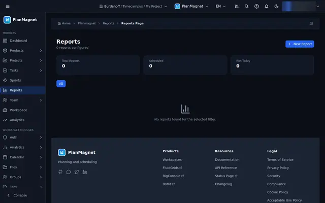
Configure recurring delivery reports by type, project and schedule, and see how many are scheduled or have run today.
2 illustrations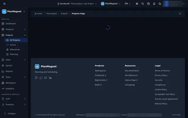
Project Portfolio and Milestones
A portfolio view that runs from every project, to the ones in flight, to the milestones they are judged by — plus a form to start the next.
4 illustrations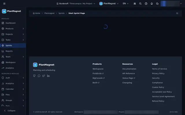
Sprint Planning and At-Risk Sweeps
Start sprints, review planning sessions across projects, and get a daily sweep that flags at-risk work with a stated reason.
3 illustrations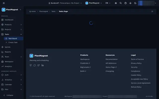
Task Board and AI Work Breakdown
The board where work moves, the form that adds to it, and an assisted breakdown that turns a paragraph of intent into reviewable work items.
3 illustrations